Week 7 Lecture Pod: UI Visual Design Patterns

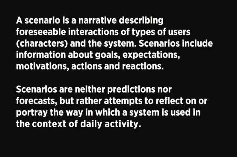
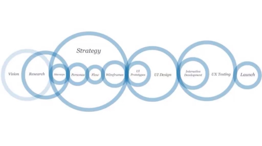
This weeks lecture pod is on visual design patterns, focusing on the best method to help the user accomplish their goals through smart and thought out interactions. Our previous work on user personas has thoroughly helped this process, as we now have an understanding of what the particular user is looking for.

Screen Shot 2018-05-14 at 4.32.33 PM.png

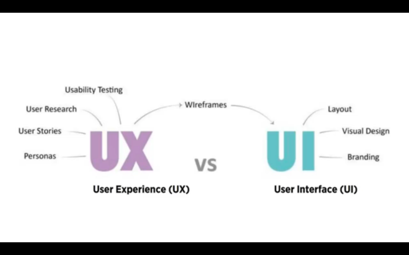
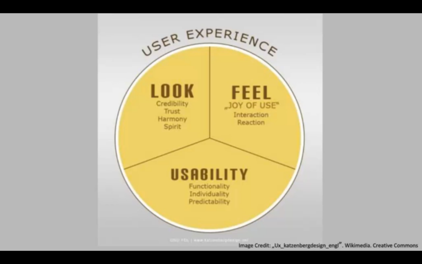
User interface is much more than buttons, Sarah says, it is the connection between the user and experience.Good UI design will have a balance between aesthetics and smart interactivity. The first impression should have a lasting impression, and will determine whether the user will come back to the interactive time and time again.

Screen Shot 2018-05-14 at 4.36.12 PM.png

Visual design patterns are recurring solutions that solve common design problems, and are usually the standard reference when creating an interactive. These are very commonly used by designers because of their prior success throughout the years, and are generally simple in interactivity.

Screen Shot 2018-05-14 at 4.39.35 PM.png

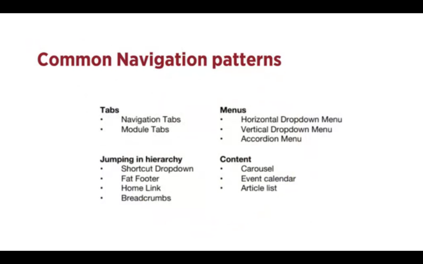
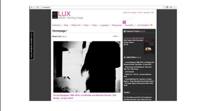
For example, here are some common navigation patterns used by designers when creating interfaces. Starting with tabs, Sarah explains how the term “Tabs” visually relates to Skeuomorphism, literally relating the interface with its real world counterpart, being the tabs in a folder or filing cabinet. Skeuomorphism is very commonly used in many forms of design, including architecture and web design. You would generally use tabs when you have between 2 – 9 sections of content, and it provides a reliable link to where the user currently is on the interactive.

The next pattern is drop down menus. These are commonly used when the user needs to navigate sections of the website or app, but there is limited space for such navigation tabs. If not used properly however, they have been known to be quite confusing, and thus should be considered greatly before input. You would typically use these when you have 2 – 9 sections of content that require a heirarchy.

Next is the search bar with a dropdown function. This is a quick way to find sections of a website without having to navigate throughout a confusing heirarchical structure. Typically it would contain a “favourites” section with common search terms based on user data. and input. You would also use this when you have shortcuts to certain pages.

Next is the “Big footer.” The footer of a interactive typically has fast links to pages that do not require their own navigation tab, such as contact or social media links. These are mostly shortcuts, and can display the most frequented pages by users as an easy access interaction, such as FAQ,

Next is the Home button, or link. All interactives, whether they be a website or application, should contain a home button that takes you back to the initial first page of contact, This is a safety measure of sorts, as users when confused or overwhelmed by content will by habit click to go back to where they first arrived, and choose to navigate the website from the start. The home button or link should be a consistent interface on all pages present, and should not be hidden or difficult to always find.

Crumbs or Breadcrumbs are used when the user needs to know where they currently are on a website, specifically if the website contains many pages of content that leads to other content. This can be seen on news article websites, when you would generally follow a topic or date to a specified news story, etc. These can often times be confusing for the user if not done correctly, and require extra thought and interaction if by chance the user needs to go back one page without losing their spot on the website.

A carousel is used when the designer or website has a large amount of items that the user needs to browse through and select, or when they want the user to only focus on a select few items at a time. You would often use this pattern when you want to tease the user as to whats to be featured when they click through, and also when you as the designer do not have a large amount of space to play with. It is also incredibly useful when you have highly visual and aesthetic items to showcase.

Tags, as their name suggests, allows the designer to tag individual posts with other posts in the event that the user needs to see all posts ascertaining to a specified topic. This is helpful if the posts vary in time and place, as well as possibly linking two posts that would look like they have nothing to do with each other. This is a highly functional aspect to interactives, and should always be used to keep a clean and easy to navigate interface for users.


Images Reference:

Waterson, S. (2016). GDIDMPOD07 [Video file]. Retrieved from  https://vimeo.com/161435877


Week 6 Lecture Pod: User Scenarios

This weeks brief pod focuses on the stories that our user personas will act out, eventually leading to the use of our software. User scenarios let us as designers understand what our future users will be looking for when trying to complete tasks, even they fail to use the application, it will help us identify problems and to solve them easily. They allow us to test our site structure, before it is fully developed, and isolate problems before they become problems. User scenarios can be very detailed, but generally must cover the basic WHO WHAT WHEN WHERE WHY HOW topics to get an understanding of the situation at hand, and how it can play out in the interface.

Screen Shot 2018-04-10 at 5.30.05 PM.png

An example is shown through a website Lux, where user Harriet needs to find a great film for her December event. The scenario then gets in her psyche, where her specific need is a winter film, her motivation being she needs to attract a large audience to make up for a small audience at her last failed event, Harriet spends minimal time on the homepage, and quickly conducts a search, finally settling on a film that interests her. She reads some details on the film, including reviews by Lux, as well as other users on the website. Finally, she hires the film, and successfully ends her interaction with the website. This user scenario perfectly highlights her motivation and thought processes.

Screen Shot 2018-04-10 at 5.38.00 PM.png

As a recap, a scenario is an outline of a scene in a play or a movie. The situation, the character, and their motivation of whats at stake. Once we identify our personas, we create plausible scenarios to explore interactions they’ll have with the product. We would generally think about this personas typical day and lifestyle, and the little problems they would solve during this time and the questions they would ask. Once we have ascertained the specifics on their life, the issues they need solved, and the context of the situation, we would then focus on the specifics of the design. The scenario will help us drive the process, helping us identify what functions will help the user satisfy the goals, how it will be used, and how they should be prioritised in the interface.


Images reference:

Waterson, S. (2016). GDIDMPOD06 [Video file]. Retrieved from https://vimeo.com/159734950

Week 5 Lecture Pod: Personas

This weeks lecture pod was based on personas, namely user personas and artefact personas, as it is a requirement for one of our assessments in Interactive Digital Media. The lecture begins with a quick look at two models of visual design, both demonstrating the importance of the user needs as a jumping off point in design.

Screen Shot 2018-04-10 at 3.21.07 PMScreen Shot 2018-04-10 at 3.21.20 PM

User personas, more or less, are references that the designer can refer back to during the creation of their interface to help validate and inform the design choices, and user experience. A user persona is the representation of the goals and behaviour of a hypothesised group of users. In most cases, they are synthesised data collected from interviews with users that are captured based on things such as behaviour patterns, goals, skills, attitude, and the environment and context. The persona is then given realistic characteristics, to help build upon the personality of the user. Although it would seem numerous personas would be helpful for a design, one user persona is usually selected as the main focus for the purpose of the design.

Screen Shot 2018-04-10 at 3.29.54 PM.png

In Coopers (1999) novel titled, “The Inmates are Running the Asylum,” he outlines the general characteristics, users, and best practices for creating personas, recommending that software be designed for single, archetypal users.

Screen Shot 2018-04-10 at 3.40.41 PM

Sarah then introduces us to a general breakdown of what a good user persona includes, creating a personality, mindset, desire, and necessary tasks for your software. Ideally, the user persona is informed by research, or established knowledge of the user base, but essentially the persona must be designed with what you need in mind. Reviewing the user profile before wireframing is essential, as it gives a clear and incisive view of what you ultimately need to be designing.

Looking at key factors in the user experience is another crucial point that must be considered, for example, a large audience vs a small audience. Who is your core audience? Who is your fringe audience? Designing for your core audience still insures that you are designing for the large portion of your user base, and will hopefully satisfy most of your fringe audience. The key is to focus on your core audience. This can be demonstrated when viewing examples such as eBay, where you must create for a very large number of users. Screen Shot 2018-04-10 at 3.50.14 PM.png

When defining personas, first, we must ask ourselves WHAT. What is the user trying to perform. Are there different tasks for different personas? Are the tasks you are designing matching up the needs of the user base? How are users getting to that task in the first place? Is what we’re designing targeted towards the middle, beginning, or end of their task?

Then, we ask HOW. Will you be serving up what the user wants directly, or do they need you to show them? if so, how will you give it to them? This will all depend on your users, and their mindset when first entering your landing page.

Mental models are what thoughts people form around an idea or activity. These vary from user to user. We are given examples of two users taking notes, where a 16 year olds mental model may involve using a smartphone app, and an elderly person may first think of using a post it note. Mental models are crucial to creating an interface, and when not considered in the design process, it can be assumed that you are creating a bad and unsuccessful piece of software. Mental models unveil the expectations of the users, and can then guide what interaction patterns you’ll be using.

Artefact Personas, unlike user personas, focus mainly on the project or product, rather than the user. This can be useful for client meetings, where often the discussions are subjective, such as, “I don’t like a certain colour,” or “I don’t like straight lines.” Having an agreed personality for the project will give everyone a context objectively for a visual design, and will keep everyone on track during the meeting if it were to veer off subjectively. Screen Shot 2018-04-10 at 4.22.19 PM.png

To develop a product personality, you would generally ask most of the questions featured above. These will very quickly help you to develop a personality for your software. This can be seen greatly in the following example, where elderly patients had stated that they would be more responsive to devices, if the device sounded like an orderly or a nurse. The groupings of keywords helped to determine what sort of software they were going to design, and the success of the device for their target market.

Screen Shot 2018-04-10 at 4.24.49 PM.png

Screen Shot 2018-04-10 at 4.27.35 PM.png

Understanding your audience and learning who it is that you’re likely to get involved with is possibly the most crucial key element in designing software. It is the base step in the design process, and from here we able to drive the orientation of the process upwards towards our finished goal.


Images reference:

Waterson, S. (2016). GDIDMPOD05 [Video file]. Retrieved from https://vimeo.com/159734165

Week 4 Lecture Pod: Instructional Design

This weeks lecture pod was based on Instructional Design, presented by Leon Cmielewski. Instructional Design is everywhere in our daily lives, and thus should be taken into great consideration when designing for a specific brief. During the beginning of the lecture pod, centred on revision, Leon comments that without an effective instructional, daily activities such as using phones, parking meters, and even toasters, would become infuriating. He also points out that you must be aware of who your audience is, as many international designs fail because of the miscommunication between languages. He also presents the cons with being shown an abundance of information in various forms, which has the potential to overwhelm our working memory and can become essentially useless. Leon then compares the original cluttered and overwhelming instructions with the new redesign, demonstrating balance, proximity, and an effective strategy for instructional design. Screen Shot 2018-04-02 at 5.28.50 PM

After the initial revision, we then move onto Kinds of Interaction, presented originally by Alberto Cairo. These can be broken into 4 different types on interaction, starting with basic Instructions, where the user is simply clicking buttons. Next, there is Conversation, where the user can interact by putting in their own values, and having the interaction change based on these variables. Next, there is Manipulation, where drag and drop elements encourage the user to think and interact with the design on screen. And lastly, there is Exploration, my personal favourite, as it can most commonly be demonstrated through “open world” games, such as GTA and Skyrim. This type of interaction is perhaps the most engaging, as it encourages the user to almost physically enter the game and make important choices that can possibly change the events of the game itself.


Screen Shot 2018-04-02 at 5.43.52 PM

Leon ends the lecture pod by asking the designer about the challenges and opportunities in instructional interactive design. He presents points such as limited screen size, and limited resolution in the challenges of working with this type of design. On the plus side however, he presents the opportunities of working with time based design, which can depend on the users actions, as well as layering information in relation with the time based design, to further engage the audience in the interactive.

The question is then proposed, “what do your users want?” in relation to interactive and instructional design. He makes point of the advantages of static design, where the user is able to really focus on certain aspects as need be, and is able to clarify on things they are unsure of. This sort of design is called “Redundancy,” and is predominantly demonstrated through choices the designer makes, such as giving the user the ability to skim back and forth between verbal instruction and visual aid, thus giving the user a sense of control and empowerment over their information.

Screen Shot 2018-04-02 at 5.56.46 PM


Images reference:

Cmielewski, L. (2016). GDIDMPOD04 [Video file]. Retrieved from https://vimeo.com/159655661

Week 3 Lecture Pod: Design Patterns

This weeks topic was design patterns, which are screen design basics based on composition and user interface. These can be split into groups, mainly being tablet, phone, and computer interface. This begins with a graphic showing the “mobile first” initiative, which is basically starting with the smallest screen first, as it is more effective to adapt a smaller screen to a large tablet, than a large screen to a smaller one.

714CDEDA-83BB-418C-96EE-F6E29E0E8DAF

From here, we then progress to an intro on design patterns, which go beyond the scope of repetition, but instead rely heavily on user interactions. With the rising popularity in responsive design, it is clear to see a pattern forming amongst websites, including even our own blog. The lecture than shows the ever popular “hamburger” design, which has almost universally turned into the symbol for “menu.” Used to ultimately save space, the design can showcase a number of hidden pages, and is a favourite amongst minimalistic design websites.

From here, we are shown a great selection of other popular pattern designs, including “bite-sized” account registration, the long scroll (popular amongst phone and tablet users), the card layout demonstrated wonderfully in websites such as Pinterest, many forms of animation design which should be used in moderation (and mostly without sound to avoid annoying viewers), material design such as google where the main focus is the user interface, responsive design which aims to be both minimalistic and performance driven, and finally, flat design.

To sum up the lecture pod, we are reminded that although aesthetically pleasing and effective for the general population, it is important not to rely on trends, and to really focus on who we are designing for, and for what purpose. Interactive design is essentially the practices a user must engage in to achieve a specific goal, and the outcome or solution must tailor to that goal, not what is trending at the time.


Images reference:

Waterson, S. (2016). GDIDMPOD03 [Video file]. Retrieved from  https://vimeo.com/159663778

Week 2 Lecture Pod: Process + Context

This lecture pod gave an in-depth look at the process and context behind interactive design. Beginning with a diagram by Bill Verplank, he demonstrates how the process of creation more often than not begins with an error, and how we as designers can progress from this stage, and use this error, as a jumping off point for our design.

4A2E7989-D9E1-4041-A902-026652C1D58A.jpeg

From here, we are then presented with faux client profiles, to help us better understand who we are designing for, in a hypothetical context. This exercise further demonstrates good practice in process, as designers are encouraged to learn more about who we are designing for, and how we can better understand their needs to solve and create the perfect interactive media for them.

04F5ED49-4DF7-45D5-ACBE-E128C93E1982

Progressing through the lecture, we then reach the short, but nonetheless fruitful, topic of context. Here we are presented with a number of slides featuring the right questions we as designers should be asking ourselves daily in our process. These questions help to highlight the context in which our designs will be placed, and demonstrate to the audience what good interactive design should feature. Questions such as What, Who, When, How, and Where, are brought into focus, reminding us that asking the right questions and finding the correct context can make or break a design.

The lecture then finishes with a reminder of a the basic and necessary structure of interactive design.

9F01FE6A-B323-426C-BE1D-0E88123582B9.jpeg

Images reference:

Waterson, S. (2016). GDIDMPOD02 [Video file]. Retrieved from  https://vimeo.com/159662636

Week 1 Lecture Pod: Introduction to Interactive Design

As a designer, it is expected that we know the basics of interactive design, and that we be able to confidently and successfully implement it into our works. Following through the lecture pod, we are led to a short design clip by Bill Verplank, where he introduces an easy to follow thought process to interactive design for designers and users. This can be seen below.

Screen Shot 2018-03-16 at 7.38.29 PM

Using examples of different design jobs and how they all bare some relation to interactive design, the lecture pod shows how cognitive behaviour is a key element in successful design. Through this, we learn that interactive design is essentially targeted towards how the audience can control it, and use it to their advantage. All design should aim to have a purpose, and interaction design is an excellent example of supportive data.

Screen Shot 2018-03-16 at 7.45.47 PM.png

Perhaps my favourite point in the lecture is the presentation of the graph below, demonstrating how different values and perception can translate across interactivity. Presented here is a relatable breakdown of everyday activities based on their engagement and reactive behaviour. I found this incredibly interesting as I had not realised that where I am thoroughly engaged in a book, it does not require me to be terribly reactive to it, whereas an interesting conversation requires both engagement and reactivity to survive. From this, I could easily grasp the concept of interactive design more thoroughly.

Screen Shot 2018-03-16 at 7.50.46 PM.png

Reaching the end of the lecture pod, a final graphic helps to solidify the basics of interactive design. The graphic presented demonstrates the way data in its raw stages can finally progress to the audience, and reach its intended destination, becoming wisdom. In using interactive design, the aim is to produce legible and transmittable information with a purpose, and to eventually become knowledge and experience for the audience.

Screen Shot 2018-03-16 at 7.58.36 PM.png


Images reference:

Waterson, S. (2016). GDIDM_POD01 [Video file]. Retrieved from https://vimeo.com/159653223