Click the link above to test Project Vitamin Sea and leave feedback.
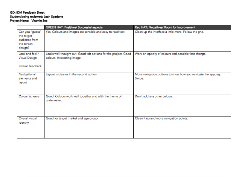
Phase 1 Review Sheets
Click the link above to test Project Vitamin Sea and leave feedback.
Phase 1 Review Sheets
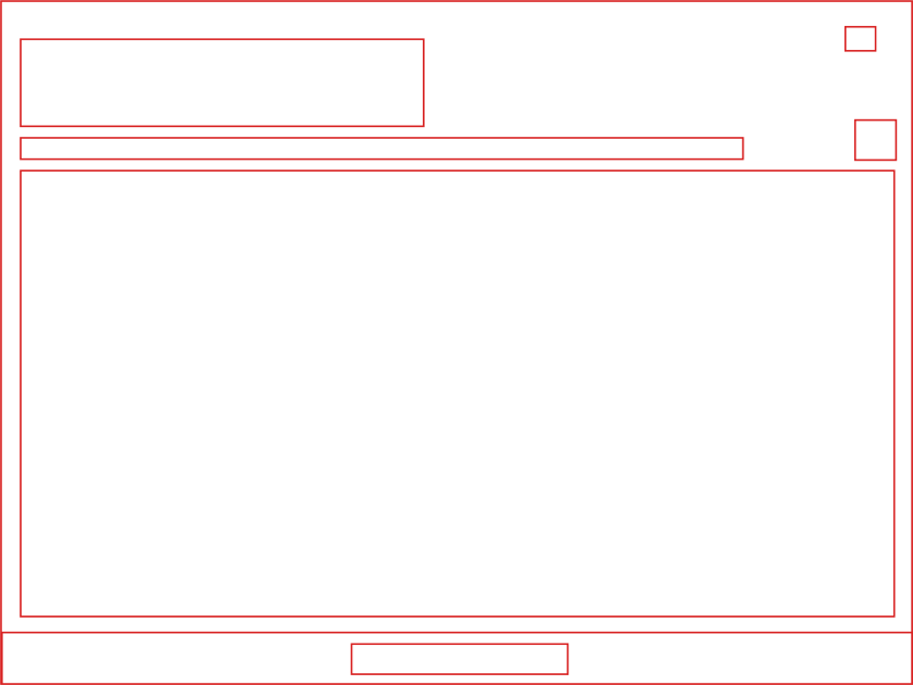
The interactive is about nuclear explosions, specifically how different nuclear bombs tested in recent years can detonate a specified area. The user can enter any location, and is then given an interactive look at how the destruction would effect the area, eg. The total number of deaths, injuries, as well the total kilometers for the initial fireball, radiation, shock wave, and heat.
The interactive is designed for people who are looking for an interactive experience and information on nuclear weapons and nuclear mass effect. Primarily, this would be targeted to ages 18 and above. You would have to have some prior knowledge as to what a nuclear weapon was.
The interactive assumes that you know how to search for a location using a drop down menu. It assumes that you have prior knowledge about the information it provides. It assumes that you know how to navigate an interactive app using different devices, because the interactive itself contains a varying amount of hover information and jump to interfaces.
Generating a blast shows the effects in order in the form of an animation.
Users can interact with the bomb blast by hovering over the different categories of the blast damage and in doing so, the respective effect and distance is highlighted on the right and vice versa. Selecting a particular effect, either from the diagram or from the list brings up information describing the effect.
User can also change the location, bomb type and blast type to simulate and compare the different impacts of each bomb blast.
Overall the design is fairly minimalistic, focusing on the visuals and the data. That also goes for the colour palette and typography: using only tones of greys and reds plus white, with two fonts being used, a serif and san-serif font. The layout is clean and straightforward in its presentation of the different elements.
o Perhaps add more background information on the types of bombs – history of use
o The background is quite dark which could make it hard to read the map. Lighter greys can be substituted in.
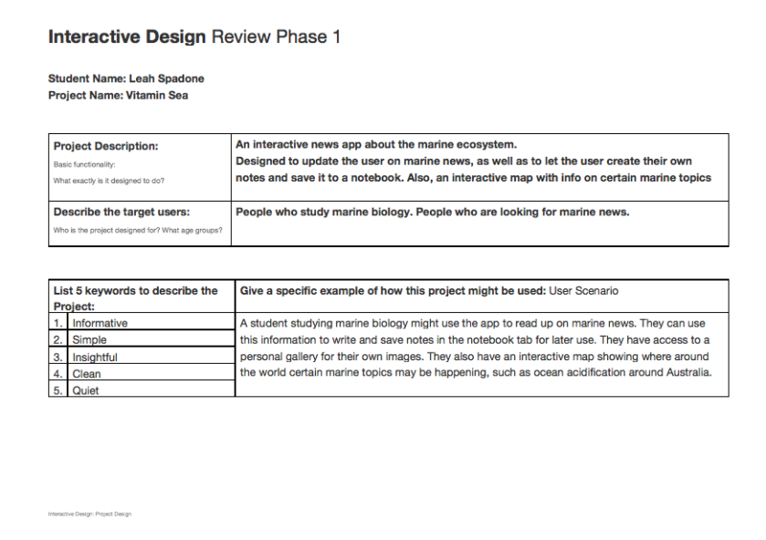
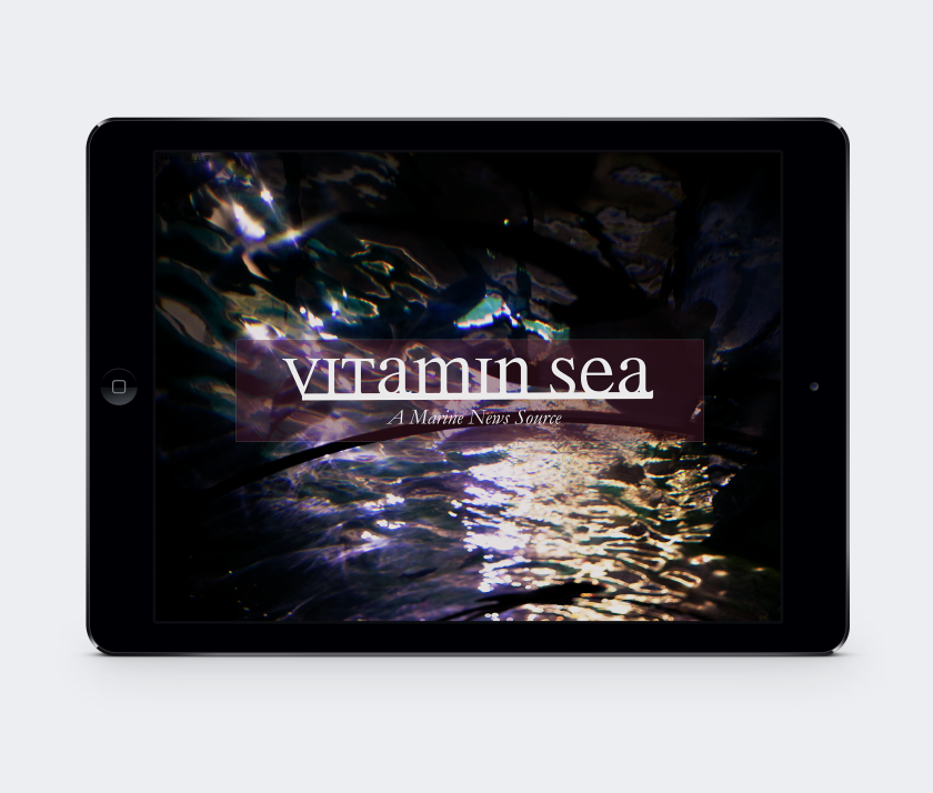
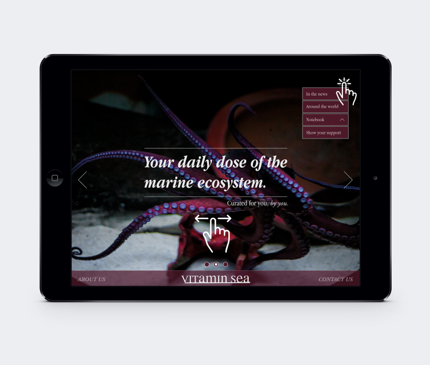
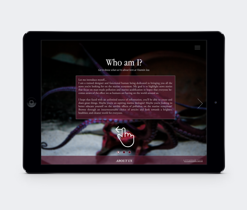
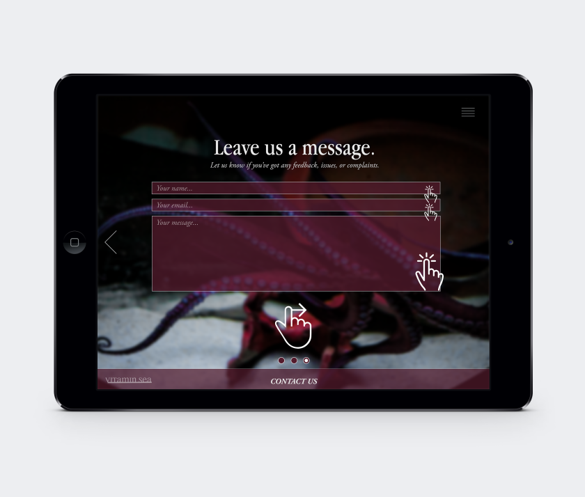
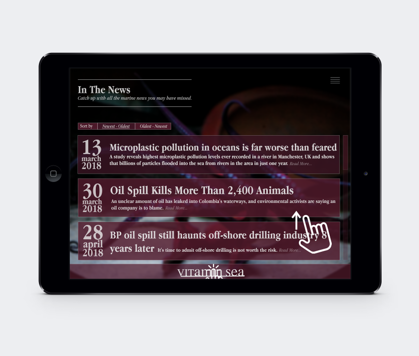
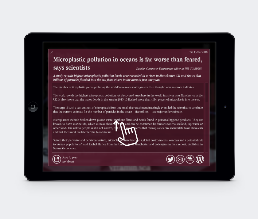
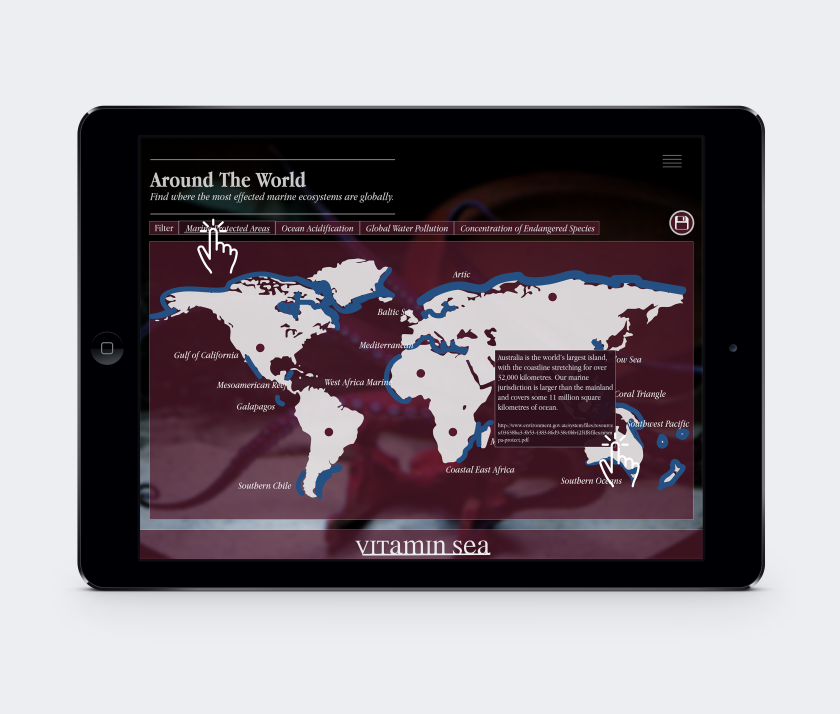
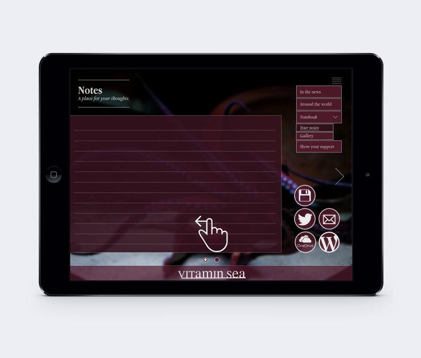
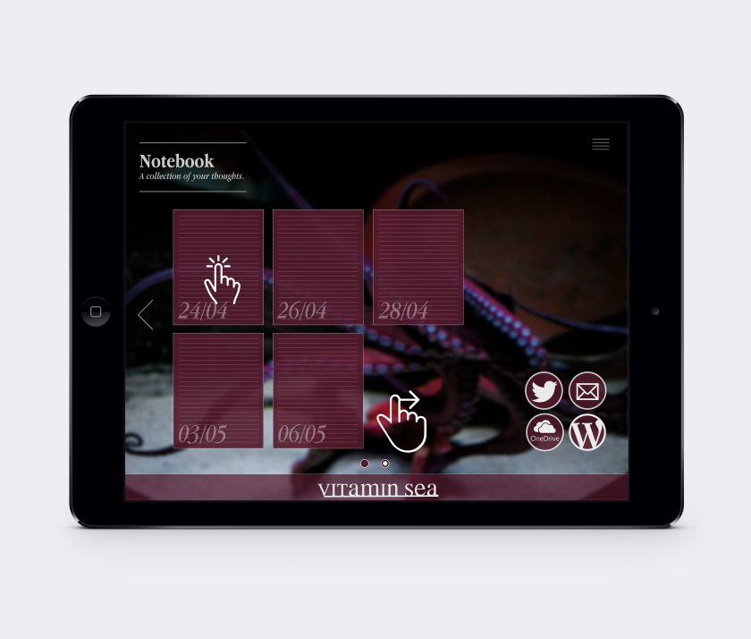
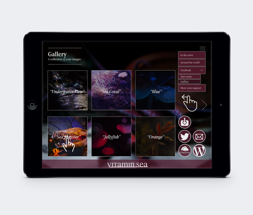
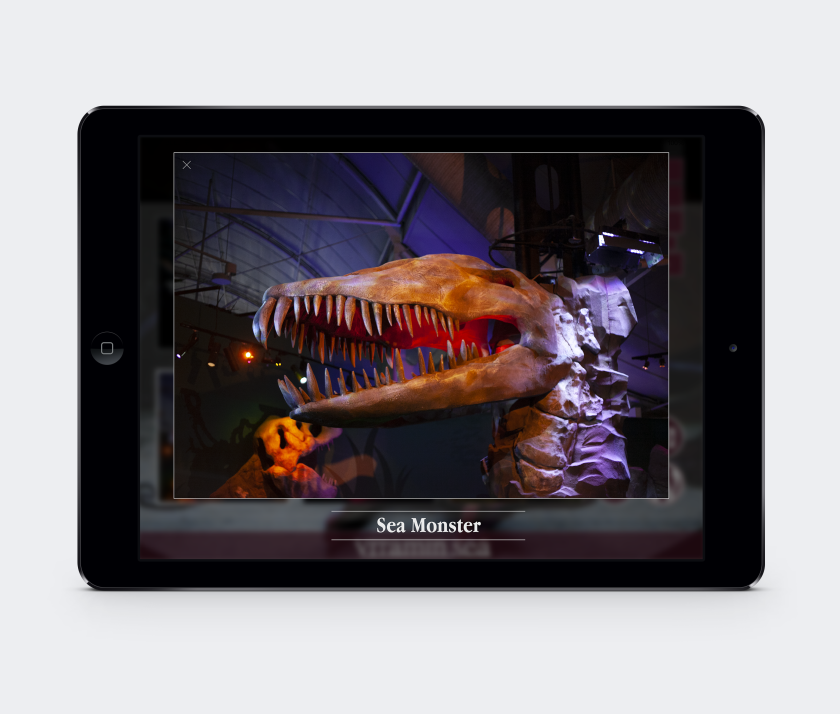
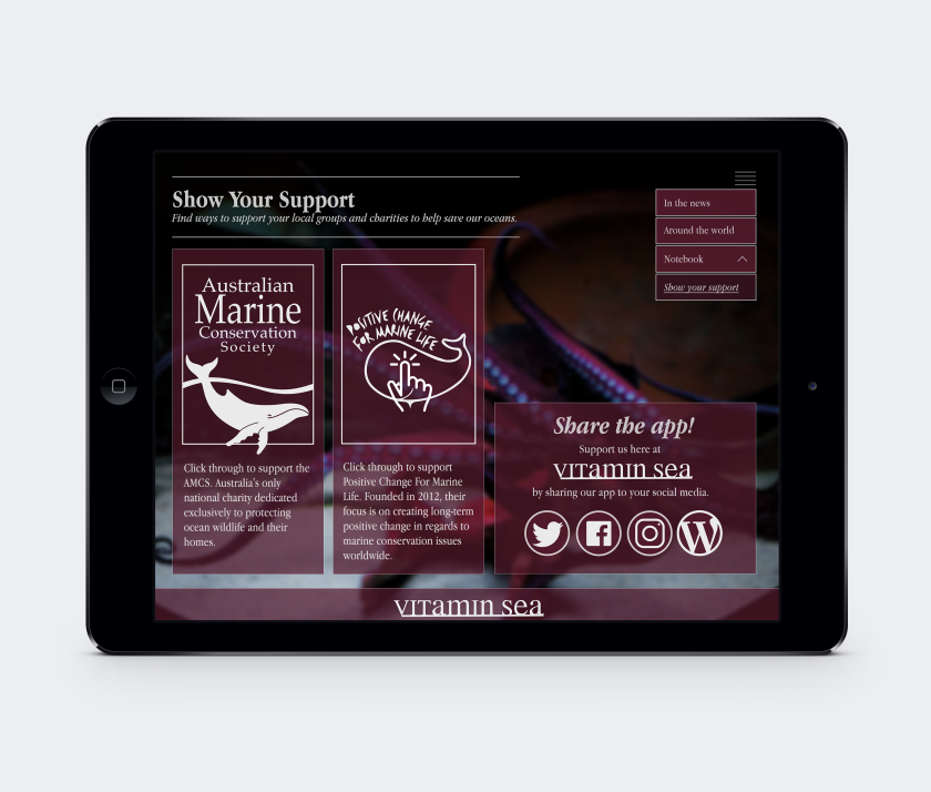
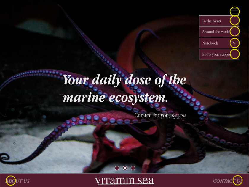
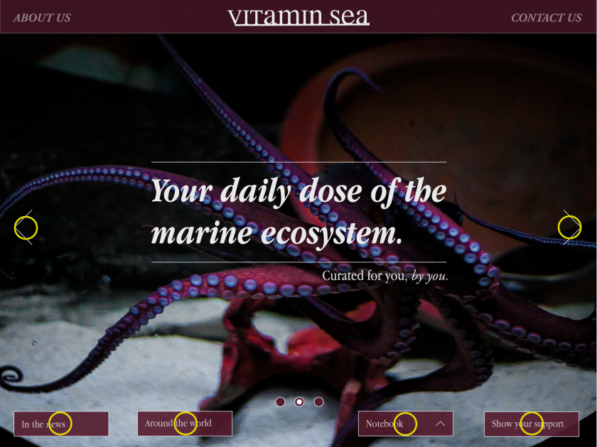
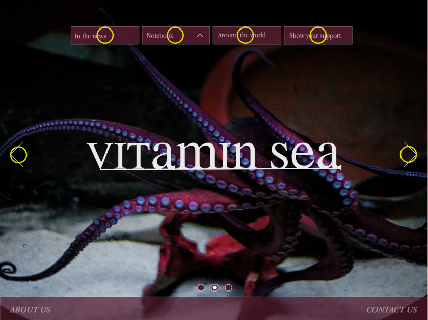
The official mock-ups are here for Project Vitamin Sea! Our app is an interactive design experience into the marine world, showcasing international news stories about marine sea life, pollution, and ocean acidification, and featuring your own private notebook and gallery. Dive in and stay hydrated with the worlds largest natural resource!
In class review sheet by 3 anonymous users:
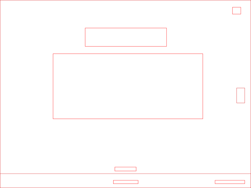
Original Design:
![]()
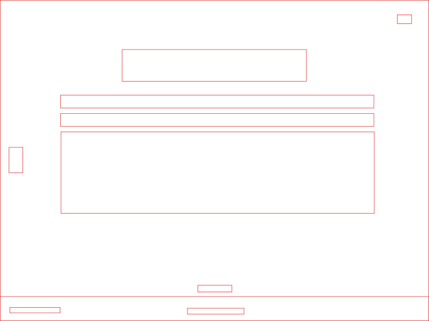
Redesign:
![]()
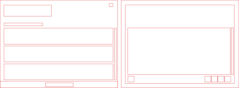
Original
Redesign
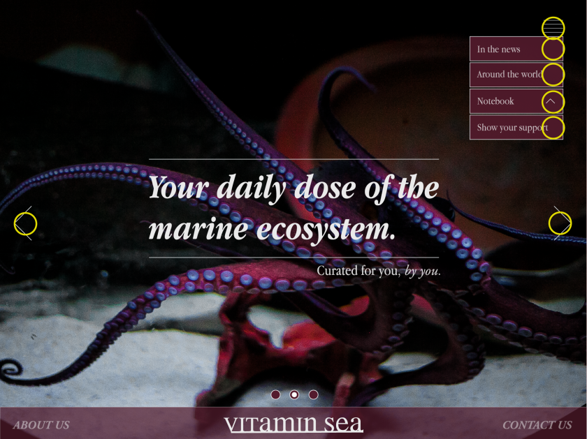
The re-design is successful and has thoroughly improved the app. More navigation points were added to show that this screen can be swiped either left or right. The opacity on the footer of the screen has been lowered to lessen the harshness of colours and tones. Horizontal lines have been added above and below the text in the middle to keep the layout clean, and to draw attention to the information.
This weeks lecture pod is on visual design patterns, focusing on the best method to help the user accomplish their goals through smart and thought out interactions. Our previous work on user personas has thoroughly helped this process, as we now have an understanding of what the particular user is looking for.
User interface is much more than buttons, Sarah says, it is the connection between the user and experience.Good UI design will have a balance between aesthetics and smart interactivity. The first impression should have a lasting impression, and will determine whether the user will come back to the interactive time and time again.
Visual design patterns are recurring solutions that solve common design problems, and are usually the standard reference when creating an interactive. These are very commonly used by designers because of their prior success throughout the years, and are generally simple in interactivity.
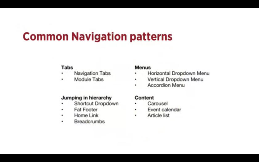
For example, here are some common navigation patterns used by designers when creating interfaces. Starting with tabs, Sarah explains how the term “Tabs” visually relates to Skeuomorphism, literally relating the interface with its real world counterpart, being the tabs in a folder or filing cabinet. Skeuomorphism is very commonly used in many forms of design, including architecture and web design. You would generally use tabs when you have between 2 – 9 sections of content, and it provides a reliable link to where the user currently is on the interactive.
The next pattern is drop down menus. These are commonly used when the user needs to navigate sections of the website or app, but there is limited space for such navigation tabs. If not used properly however, they have been known to be quite confusing, and thus should be considered greatly before input. You would typically use these when you have 2 – 9 sections of content that require a heirarchy.
Next is the search bar with a dropdown function. This is a quick way to find sections of a website without having to navigate throughout a confusing heirarchical structure. Typically it would contain a “favourites” section with common search terms based on user data. and input. You would also use this when you have shortcuts to certain pages.
Next is the “Big footer.” The footer of a interactive typically has fast links to pages that do not require their own navigation tab, such as contact or social media links. These are mostly shortcuts, and can display the most frequented pages by users as an easy access interaction, such as FAQ,
Next is the Home button, or link. All interactives, whether they be a website or application, should contain a home button that takes you back to the initial first page of contact, This is a safety measure of sorts, as users when confused or overwhelmed by content will by habit click to go back to where they first arrived, and choose to navigate the website from the start. The home button or link should be a consistent interface on all pages present, and should not be hidden or difficult to always find.
Crumbs or Breadcrumbs are used when the user needs to know where they currently are on a website, specifically if the website contains many pages of content that leads to other content. This can be seen on news article websites, when you would generally follow a topic or date to a specified news story, etc. These can often times be confusing for the user if not done correctly, and require extra thought and interaction if by chance the user needs to go back one page without losing their spot on the website.
A carousel is used when the designer or website has a large amount of items that the user needs to browse through and select, or when they want the user to only focus on a select few items at a time. You would often use this pattern when you want to tease the user as to whats to be featured when they click through, and also when you as the designer do not have a large amount of space to play with. It is also incredibly useful when you have highly visual and aesthetic items to showcase.
Tags, as their name suggests, allows the designer to tag individual posts with other posts in the event that the user needs to see all posts ascertaining to a specified topic. This is helpful if the posts vary in time and place, as well as possibly linking two posts that would look like they have nothing to do with each other. This is a highly functional aspect to interactives, and should always be used to keep a clean and easy to navigate interface for users.
Images Reference:
Waterson, S. (2016). GDIDMPOD07 [Video file]. Retrieved from https://vimeo.com/161435877
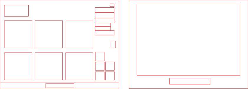
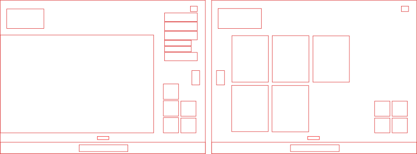
Option 1 for iPad
Option 2 for iPad
Option 3 for iPad
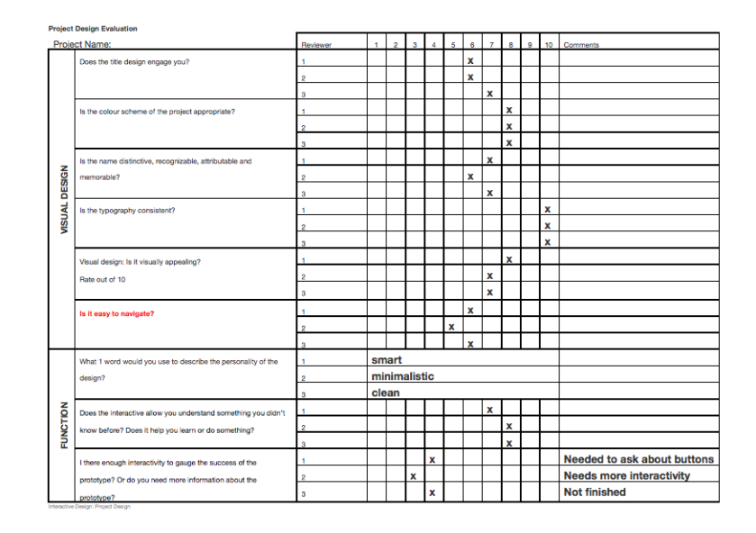
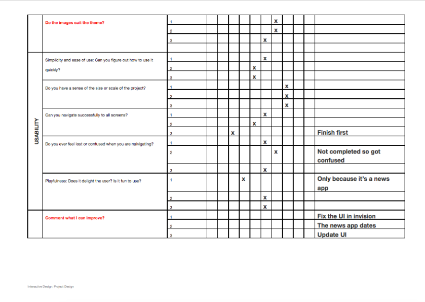
Feedback review sheet from class peers.
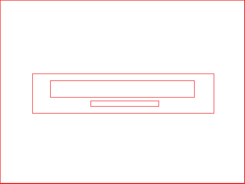
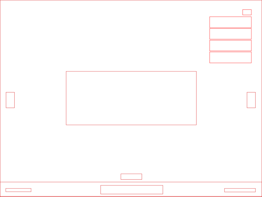
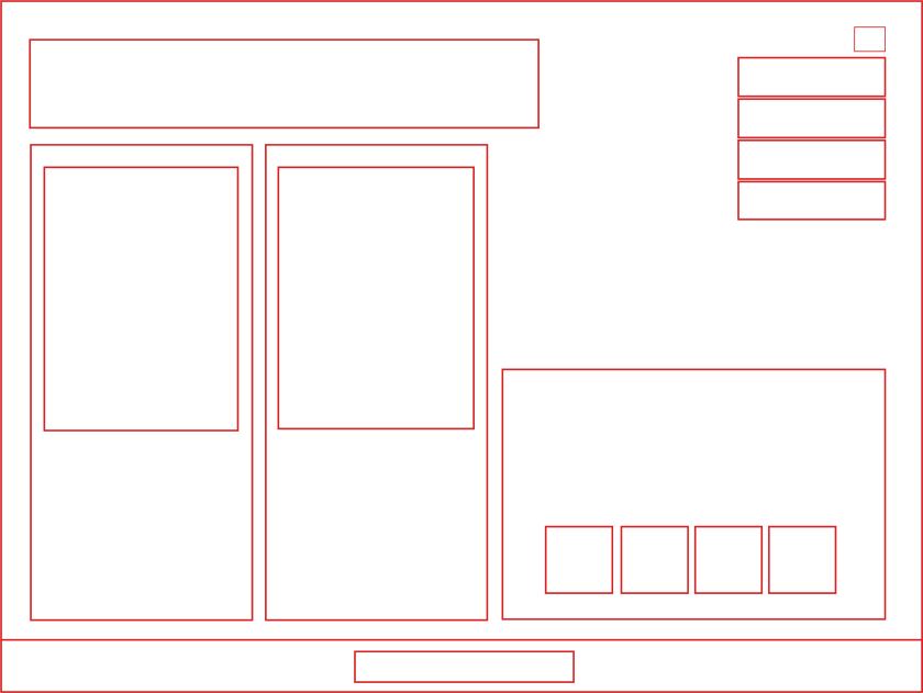
Basic wireframes for our interactive app, Vitamin Sea.
User scenarios based on the user personas for Project Vitamin Sea.
Catherine Nettle: User Scenario
Catherine Nettle is 24 years old and currently a 3rd year marine biology student in Sydney, Australia. As an over-achieving student, she has begun to research her 4th year field project, which will be based on the pollution and chemical run off effect into the world’s oceans from man-made factories and chemical plants.
During a late tutorial on a rainy Thursday, Catherine is asked by her tutor for an update on her field project, and to write down a hypothetical solution to any recent event where chemicals have polluted their surrounding oceans, to which she could then incorporate into her report later on. Having trouble finding any information solely based on this topic, she types in “acidity and pollution in the ocean” in google, to be shown the app downloadable through the app store. The app is available on her mobile device and tablet, as she needs it asap in class, as well as travelling on the train home that afternoon. Catherine secretly uses the app in class to quickly record her notes from that day by inputting her own data, as well as using it to find the proper source on a marine news story she has chosen for her hypothetical situation.
When the tutorial ends, Catherine quickly packs up her eco-friendly backpack, and steadily heads for the train, where she finds a comfortable seat and is able to continue browsing news stories, and thoroughly enjoy the “around the world” map function that allows her to pan a virtual flat model of the world, and that details specific marine mammals and they’re current health climate. When she arrives home, she shucks off her parka jacket, and decides to share the news stories to her social media following, and she is able to do so through various share interactions to her Twitter and WordPress. A short time later, her phone is a-buzz by her small, but passionate, following. They are grateful for the share, as they had not seen the article in the news or online, as marine life is not particularly a front-page story. Catherine is happy with her fast progress and knowledge and continues to scroll through the news stories she may have missed.
Hugh Jass: User Scenario
Hugh Jass is 47 years old, and current Chairman of WiLuv-NoWun Chemical Plant, based in the factory and harbour hub of Sydney, Australia. It is a dreary Friday morning, and Hugh has just prepared his tall espresso from his $5000 coffee machine, when phone 3 of 5 begins to rattle in his briefcase. He takes a large sip of his coffee, burning his tongue, before fumbling around and finally grabbing hold of the phone. With coffee still in his mouth, his second in charge, Al. Terry, shouts through the receiver that there has been a major article published in Sydneys’ biggest newspaper, accusing his company of knowingly dumping chemicals and pollutants into the ocean.
Spitting whatever coffee remains in his mouth onto the driver’s side window, Hugh speeds into the city and is confronted entering the building by a horde of reporters demanding answers to the most burning questions. Hugh makes the mistake of pausing to answer said questions without first consulting his PR department and is viciously socially torn apart for his lack of knowledge on anything involving the marine ecosystem, or the impact his company has had on its surrounding environment. Utterly mortified, Hugh slinks to his private office, and vows to redeem himself at his next interview and PR event. He intercoms his assistant to find any information on the damning article of his company, and she quickly responds by suggesting the app, found through referral from a friend in university, that features the article, as well as other similar news stories from around the world. Hugh quickly downloads the application, cancels his early brunch with his second wife and third girlfriend, and spends the afternoon taking notes in-app on various international and domestic companies, and how he can rectify the mistakes he has made. He then shares the notes straight from his phone to Onedrive, where he can then print them and keep them in his private “Redemption” folder in his safe at home.
This weeks brief pod focuses on the stories that our user personas will act out, eventually leading to the use of our software. User scenarios let us as designers understand what our future users will be looking for when trying to complete tasks, even they fail to use the application, it will help us identify problems and to solve them easily. They allow us to test our site structure, before it is fully developed, and isolate problems before they become problems. User scenarios can be very detailed, but generally must cover the basic WHO WHAT WHEN WHERE WHY HOW topics to get an understanding of the situation at hand, and how it can play out in the interface.
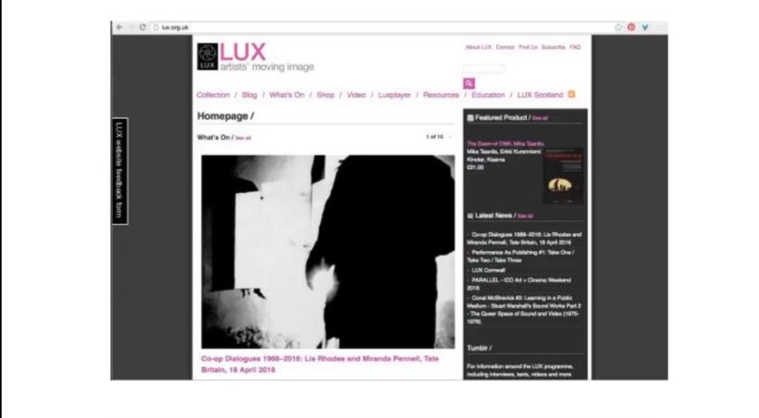
An example is shown through a website Lux, where user Harriet needs to find a great film for her December event. The scenario then gets in her psyche, where her specific need is a winter film, her motivation being she needs to attract a large audience to make up for a small audience at her last failed event, Harriet spends minimal time on the homepage, and quickly conducts a search, finally settling on a film that interests her. She reads some details on the film, including reviews by Lux, as well as other users on the website. Finally, she hires the film, and successfully ends her interaction with the website. This user scenario perfectly highlights her motivation and thought processes.
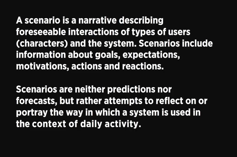
As a recap, a scenario is an outline of a scene in a play or a movie. The situation, the character, and their motivation of whats at stake. Once we identify our personas, we create plausible scenarios to explore interactions they’ll have with the product. We would generally think about this personas typical day and lifestyle, and the little problems they would solve during this time and the questions they would ask. Once we have ascertained the specifics on their life, the issues they need solved, and the context of the situation, we would then focus on the specifics of the design. The scenario will help us drive the process, helping us identify what functions will help the user satisfy the goals, how it will be used, and how they should be prioritised in the interface.
Images reference:
Waterson, S. (2016). GDIDMPOD06 [Video file]. Retrieved from https://vimeo.com/159734950
